Napalm Deaths Scum did to Grindcore what the 10 Commandments did to Abrahamic religions; laying the most fundamental foundations which without excludes you from association. The musical legacy includes some of Grinds most recognisable trademarks be it the blast beat, down tuned fuzzy churning guitar work, the microsong and the use of hammering together of punk and metal, however an often overlooked feature is the influence of the art work, although no way near as significant as the musical consequences it has some quirky outcomes.
Napalm Death - Scum
The one and only Napalm Death's Scum, released in 1987, the artwork reeks of punk, from all the large company names piled amongst skulls with politicians/fat cats atop them, and an industrial backdrop whilst an ever present and eye catching angel of death accompanies and approves their decisions.
The one and only Napalm Death's Scum, released in 1987, the artwork reeks of punk, from all the large company names piled amongst skulls with politicians/fat cats atop them, and an industrial backdrop whilst an ever present and eye catching angel of death accompanies and approves their decisions.
Caninus - Wolfpig
Yes I know I showed you guys this one last time, but this one is too good to leave out, plus my list would be too short without it.
Napalm Deaths logo has been replaced with that of Caninus, the elites have had their their service sector mugs replaced with that of dogs, and one can clearly spot the addition of IAMS and ALPO in the list of company billboards, alongside three aggressive looking canines. No love for chihuahuas Caninus?
New York Against the Belzebu - Stunt
Screw marxism and populism, the elites and bourgeoisie are nothing it is the institutional hate mongers that are the real scum, is the message of New York against the Belzebu. There artwork reflects this, altering the dystopian feel of Scum, to that of 250 pixel by 250 pixel image of culprits of demagogy and internal prejudice.
Rotten Sound - Napalm
This Napalm Death tribute through and through, 3 covers, and album title called Napalm in Naplam Death styled font and Scum styled album art.
The album art has adapted to a condensed horror feel and brings the word harpie to mind the moment I look at it.
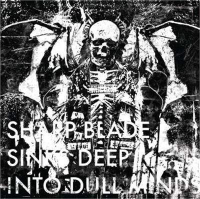
Defeatist - Sharp Blades Sink Deep Into Dull Minds
Whether or not this was design was based off Scum, I don't know , but its resemblance is too much to leave it off. Defeatist opt for a morbid less metaphorical approach, no need to work out the political mockery for there is none, they just want to show a grim foreboding corrupted death.
Know of any other albums that reflect Napalm Death's Scum, if so let me know and I shall add them to the list. On a side note, but relating to art and the real inspiration for this post, what do you guys think of the new background and logo? The logo was designed by Justin Prentince, a good friend of mine who plays in comical cannibal corpse styled band Necro Turban, check em out. The background was painstakingly designed by moi, featuring a number of albums which came to mind as I went along. Additionally a new forum is present, and much improved you can find it here, or you can click the forum button on the top bar, despite the failure of the last forum I am still determined to create a large Internet community.


